Cardstock Color Inspiration: Palettes and Combinations to Try
Choosing the right color combination can have a significant impact on your cardstock projects. Whether you're creating cards, scrapbook layouts, or other paper crafts, selecting a well-coordinated color palette can enhance the overall design and evoke specific moods or themes. In this blog post, we'll explore different cardstock color palettes and combinations to inspire your creations.

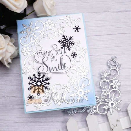
Monochromatic Elegance
For an elegant and sophisticated look, consider using a monochromatic color palette. Choose different shades and tones of a single color to create depth and dimension. For example, pair light blue with navy or pale pink with deep purple. This approach creates a cohesive and visually pleasing design while still adding interest and variety.

Bold and Vibrant
When you want your cardstock projects to grab attention and make a statement, opt for bold and vibrant color combinations. Combine colors that are opposite each other on the color wheel to create a striking contrast. For example, pair vibrant red with lime green or royal blue with bright orange. These combinations are perfect for celebratory or festive occasions and can add a sense of energy and excitement to your projects.

Soft and Serene
If you want to create a tranquil and calming vibe, opt for soft and serene color combinations. Pastel hues, such as light pink, mint green, and lavender, work well together to create a gentle and soothing palette. These colors are perfect for baby showers, weddings, or any project where a sense of tranquility is desired.

Complementary Colors
Complementary color combinations involve using colors that are opposite each other on the color wheel. These combinations create a vibrant and pleasing contrast that's visually striking. Some popular complementary combinations include yellow and purple, orange and blue, or red and green. These color palettes create a dynamic and eye-catching design while maintaining a sense of balance.

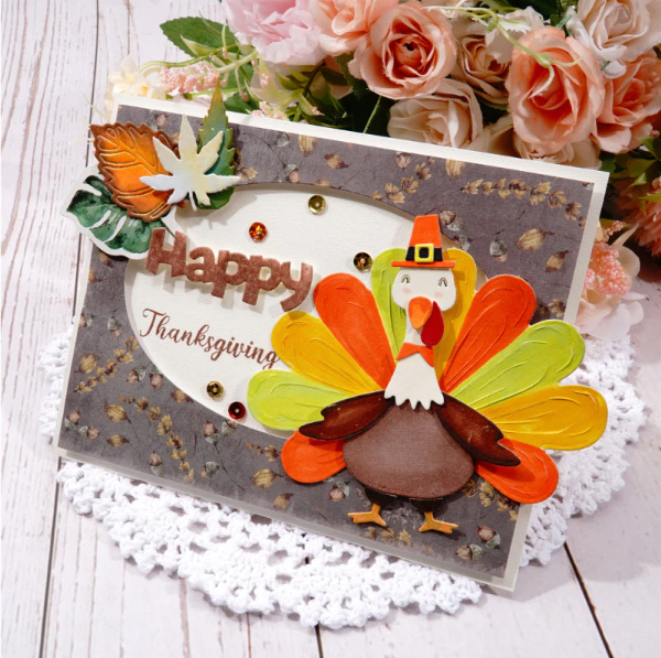
Warm and Cozy
For a cozy and inviting feel, choose warm color combinations. Utilize hues like golden yellow, burnt orange, and deep red to create a warm and inviting atmosphere. These color palettes are perfect for autumn-themed projects or for creating a sense of warmth and comfort in your designs.

Nature-Inspired
Take inspiration from nature by using earthy and natural color combinations. Consider colors like sage green, terracotta, and deep brown to create a palette that evokes a connection to the natural world. These combinations are excellent for outdoor-themed projects or for adding an organic and calming touch to your designs.

Playful and Fun
When creating projects for children or events that call for a playful vibe, opt for fun and vibrant color combinations. Mix and match bold primary colors like red, blue, and yellow for a bright and playful palette. Add pops of contrasting colors like green or orange for added interest.
The world of color combinations is vast and exciting. Use these suggestions as a starting point to spark your creativity and explore different color combinations that resonate with your project. Remember, color choices can evoke specific emotions and add depth and interest to your cardstock projects. Experiment, have fun, and let your imagination run wild.
In conclusion, choosing the right color palette for your cardstock projects can make a significant impact on the overall design and theme. From monochromatic elegance to bold and vibrant combinations, the possibilities are endless. Take inspiration from the suggestions mentioned in this blog post, and don't be afraid to explore different color combinations to create beautifully coordinated cardstock projects.
Monochromatic Elegance
For an elegant and sophisticated look, consider using a monochromatic color palette. Choose different shades and tones of a single color to create depth and dimension. For example, pair light blue with navy or pale pink with deep purple. This approach creates a cohesive and visually pleasing design while still adding interest and variety.
Bold and Vibrant
When you want your cardstock projects to grab attention and make a statement, opt for bold and vibrant color combinations. Combine colors that are opposite each other on the color wheel to create a striking contrast. For example, pair vibrant red with lime green or royal blue with bright orange. These combinations are perfect for celebratory or festive occasions and can add a sense of energy and excitement to your projects.
Soft and Serene
If you want to create a tranquil and calming vibe, opt for soft and serene color combinations. Pastel hues, such as light pink, mint green, and lavender, work well together to create a gentle and soothing palette. These colors are perfect for baby showers, weddings, or any project where a sense of tranquility is desired.
Complementary Colors
Complementary color combinations involve using colors that are opposite each other on the color wheel. These combinations create a vibrant and pleasing contrast that's visually striking. Some popular complementary combinations include yellow and purple, orange and blue, or red and green. These color palettes create a dynamic and eye-catching design while maintaining a sense of balance.
Warm and Cozy
For a cozy and inviting feel, choose warm color combinations. Utilize hues like golden yellow, burnt orange, and deep red to create a warm and inviting atmosphere. These color palettes are perfect for autumn-themed projects or for creating a sense of warmth and comfort in your designs.
Nature-Inspired
Take inspiration from nature by using earthy and natural color combinations. Consider colors like sage green, terracotta, and deep brown to create a palette that evokes a connection to the natural world. These combinations are excellent for outdoor-themed projects or for adding an organic and calming touch to your designs.
Playful and Fun
When creating projects for children or events that call for a playful vibe, opt for fun and vibrant color combinations. Mix and match bold primary colors like red, blue, and yellow for a bright and playful palette. Add pops of contrasting colors like green or orange for added interest.
The world of color combinations is vast and exciting. Use these suggestions as a starting point to spark your creativity and explore different color combinations that resonate with your project. Remember, color choices can evoke specific emotions and add depth and interest to your cardstock projects. Experiment, have fun, and let your imagination run wild.
In conclusion, choosing the right color palette for your cardstock projects can make a significant impact on the overall design and theme. From monochromatic elegance to bold and vibrant combinations, the possibilities are endless. Take inspiration from the suggestions mentioned in this blog post, and don't be afraid to explore different color combinations to create beautifully coordinated cardstock projects.


can what colores be used on white card stock paper and what can used for dark blue and purple colores and black
Leave a comment